Visual Identity
This page presents the ADBC logo, its variants, and the geometry behind them. The files are listed under Downloads.
The Logo
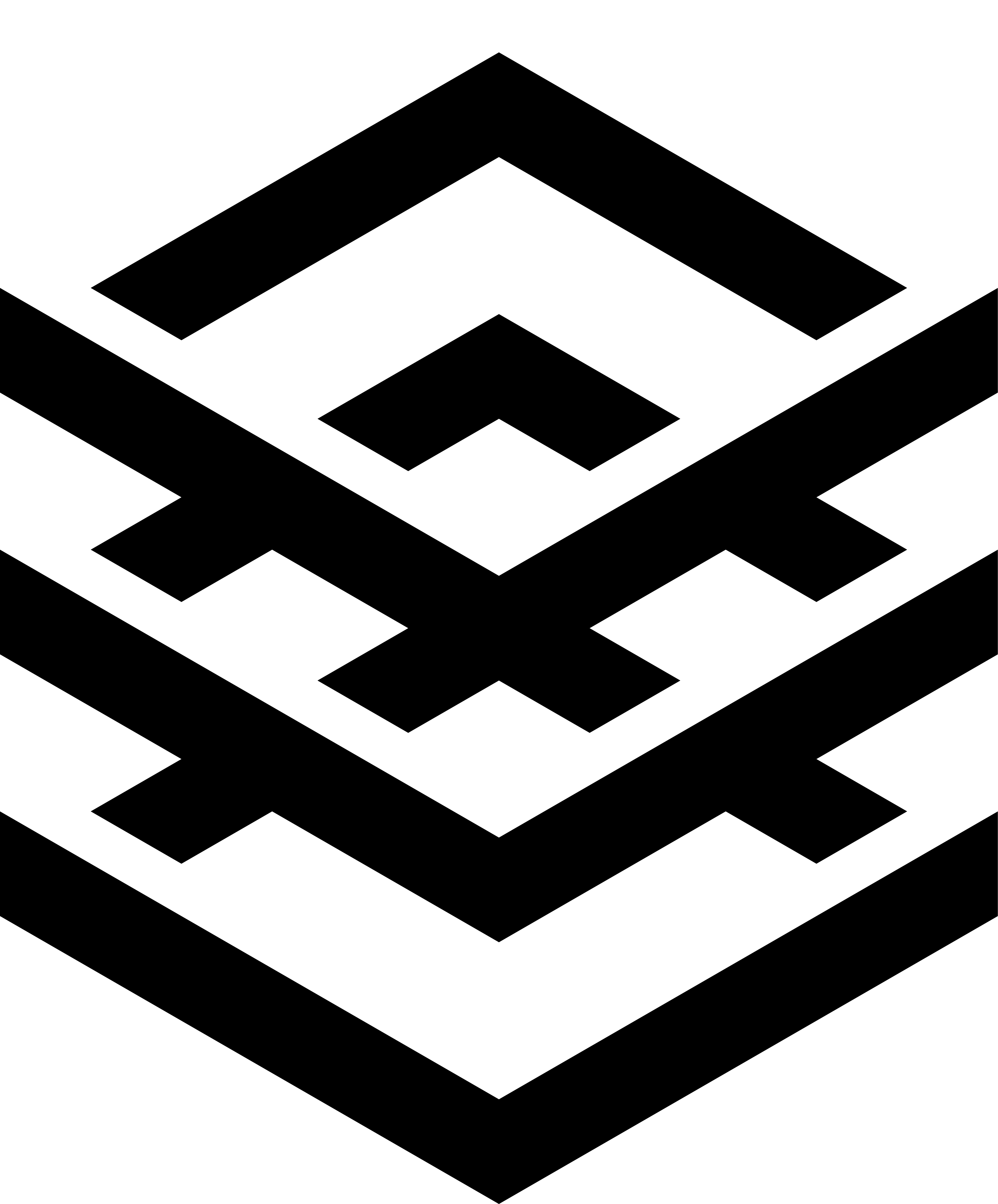
The logomark, on the left, combines two familiar pictures of data:
the classic database icon of three stacked platters, long used for databases and for ODBC; and
the triple chevrons of the Apache Arrow logo.
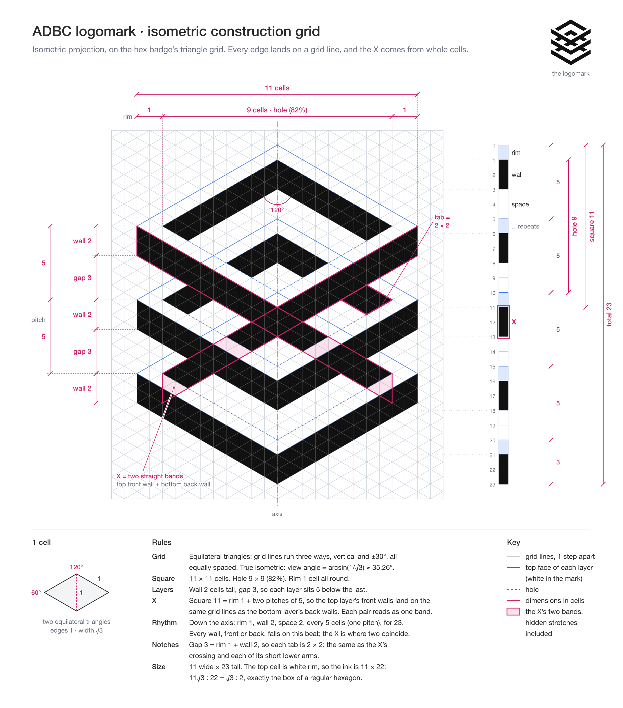
It is a stack of three square rings seen from above. Through the rings, their back walls form chevrons pointing up; below them, their front walls form three chevrons pointing down. The top ring’s front walls line up exactly with the bottom ring’s back walls, so in the middle the two directions cross in an X. Data moves both ways through ADBC: it is fetched from databases and ingested into them.
Variants
The main logo: the logomark with the name, set like the Apache Arrow wordmark: “APACHE ARROW” in Roboto Regular above “ADBC” in Barlow Bold at three times its cap height.
The mark on its own, in isometric projection. Use it wherever the name appears nearby or isn’t needed.
For hexagonal badges and stickers: the logomark in a hexagon, with “ADBC” and the project’s URL cut out of the bottom ring’s front walls.
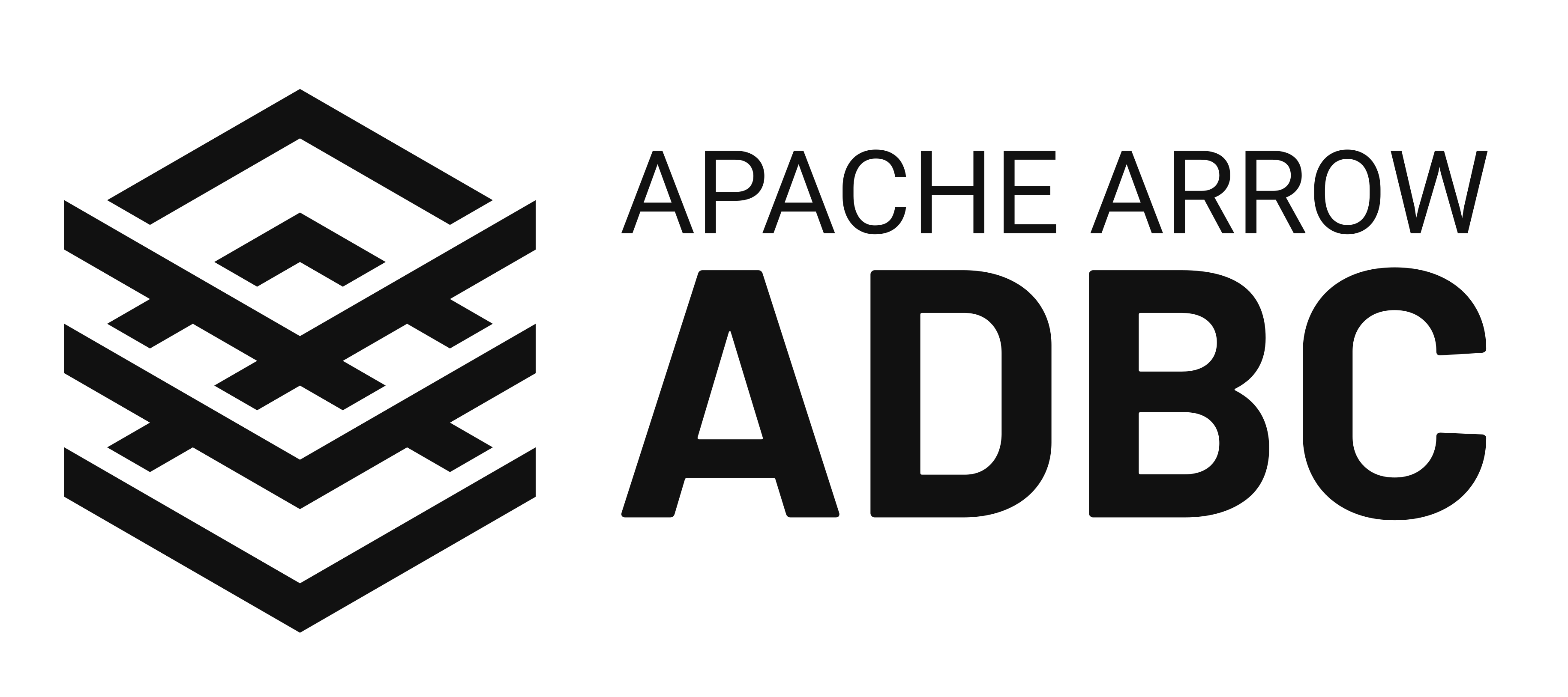
A die-cut sticker of the horizontal lockup. The edge of the white border is the cut line, so upload the print file as is.
Construction
Every variant is built on the logomark’s isometric grid, so each can be redrawn exactly.
Logomark
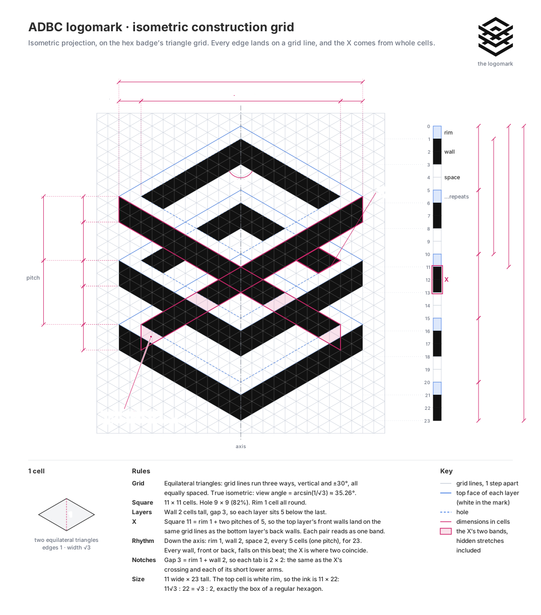
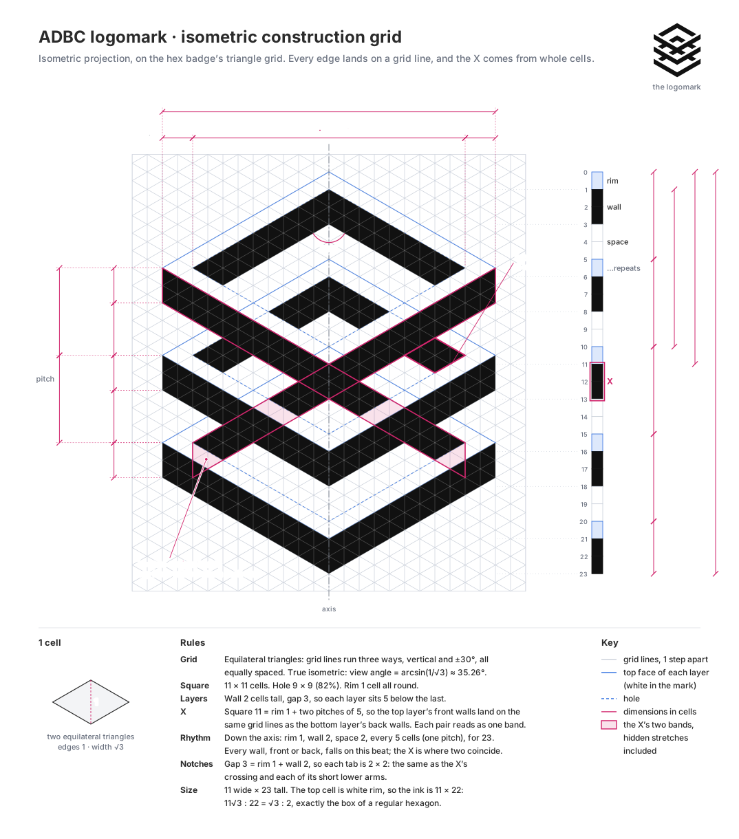
Projection: isometric, a view from arcsin(1/√3) ≈ 35.26° above the horizon. Edges run at 30°, parallel to a regular hexagon’s sides, and every angle is 60° or 120°.
Grid: equilateral triangles, with lines in three directions. A cell is two triangles.
Rings: each is 11 × 11 cells with a 9 × 9 hole, leaving a rim of 1 cell all round.
Layers: walls are 2 cells tall and gaps 3, so the layers repeat every 5 cells.
The X: a ring is 11 cells wide, its rim plus two layer repeats (1 + 5 + 5), so the top layer’s front walls fall on the same grid lines as the bottom layer’s back walls. Each pair reads as one straight band, and the two bands cross.
Rhythm: straight down the middle, rim 1, wall 2, and space 2 repeat every 5 cells for 23 cells. Every wall, front or back, falls on this beat.
Notches: each gap is a rim plus a wall (3 = 1 + 2), so each tab showing through the side notches is 2 × 2 cells, the same as the X’s crossing.
Frame: 11 × 23 cells. The top cell is the top ring’s top edge. It’s white rim, so nothing is drawn there, but it’s part of the mark, and every variant leaves room for it.
Horizontal lockup
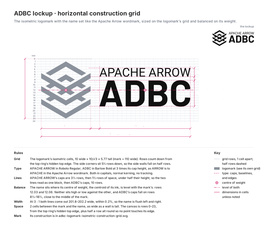
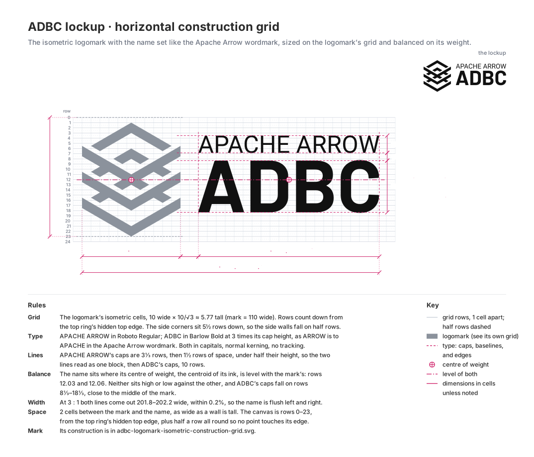
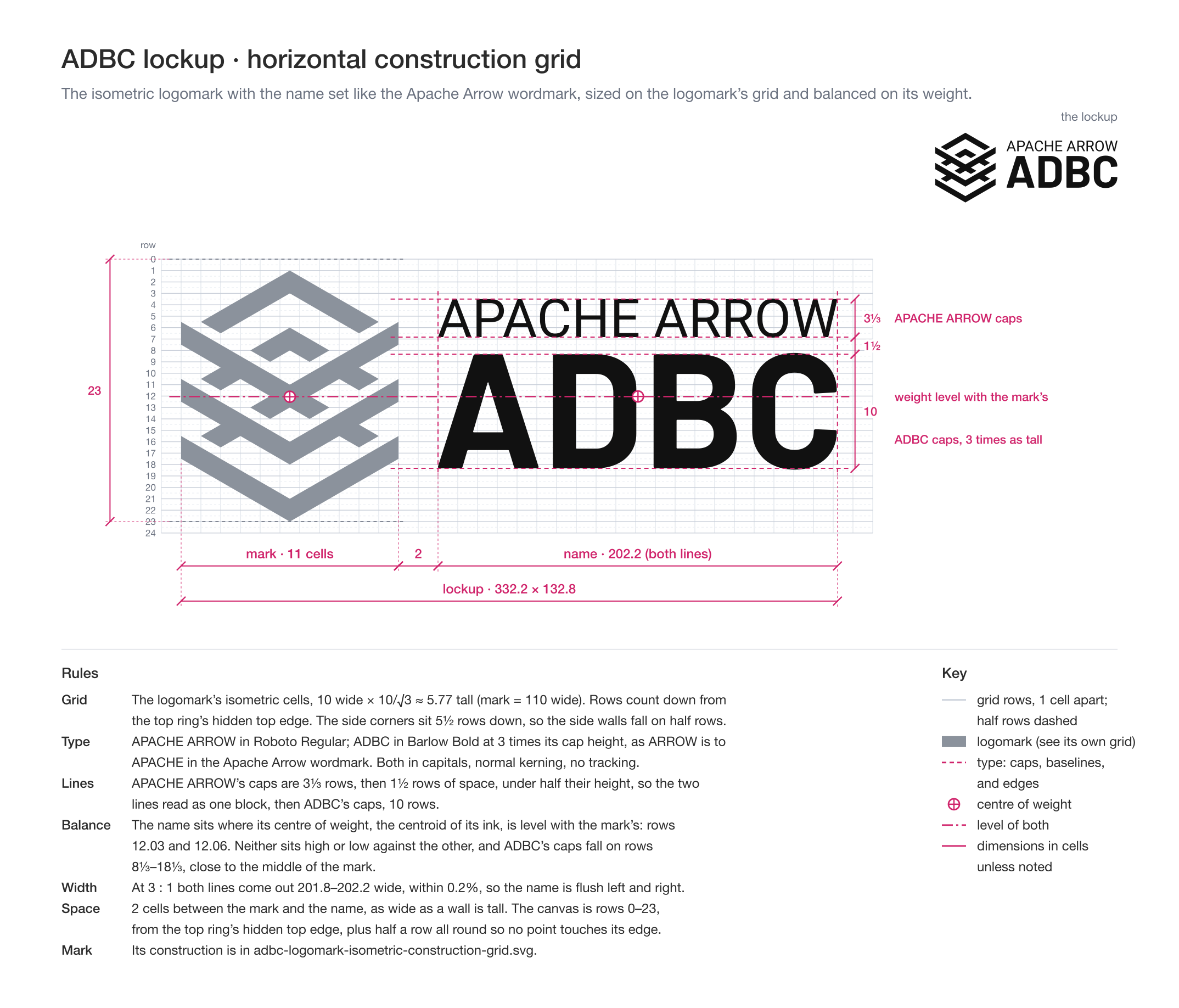
Grid: the logomark’s cells, with rows counted down from the mark’s top corner. The mark’s side corners sit 5½ rows down, so its side walls fall on half rows.
Type: “ADBC” caps are 10 cells tall and “APACHE ARROW” caps 3⅓, the same 3:1 ratio as ARROW to APACHE in the Apache Arrow wordmark.
Lines: “APACHE ARROW” sits 1½ cells above “ADBC”, under half its own cap height, so the two lines read as one block.
Balance: the name sits where its centre of weight, the centroid of its ink, is level with the mark’s, so neither sits high or low against the other. “ADBC” falls on rows 8⅓–18⅓, close to the middle of the mark.
Width: at 3:1 both lines come out the same width, so the name is flush left and right with normal letter spacing.
Spacing: the name sits 2 cells from the mark.
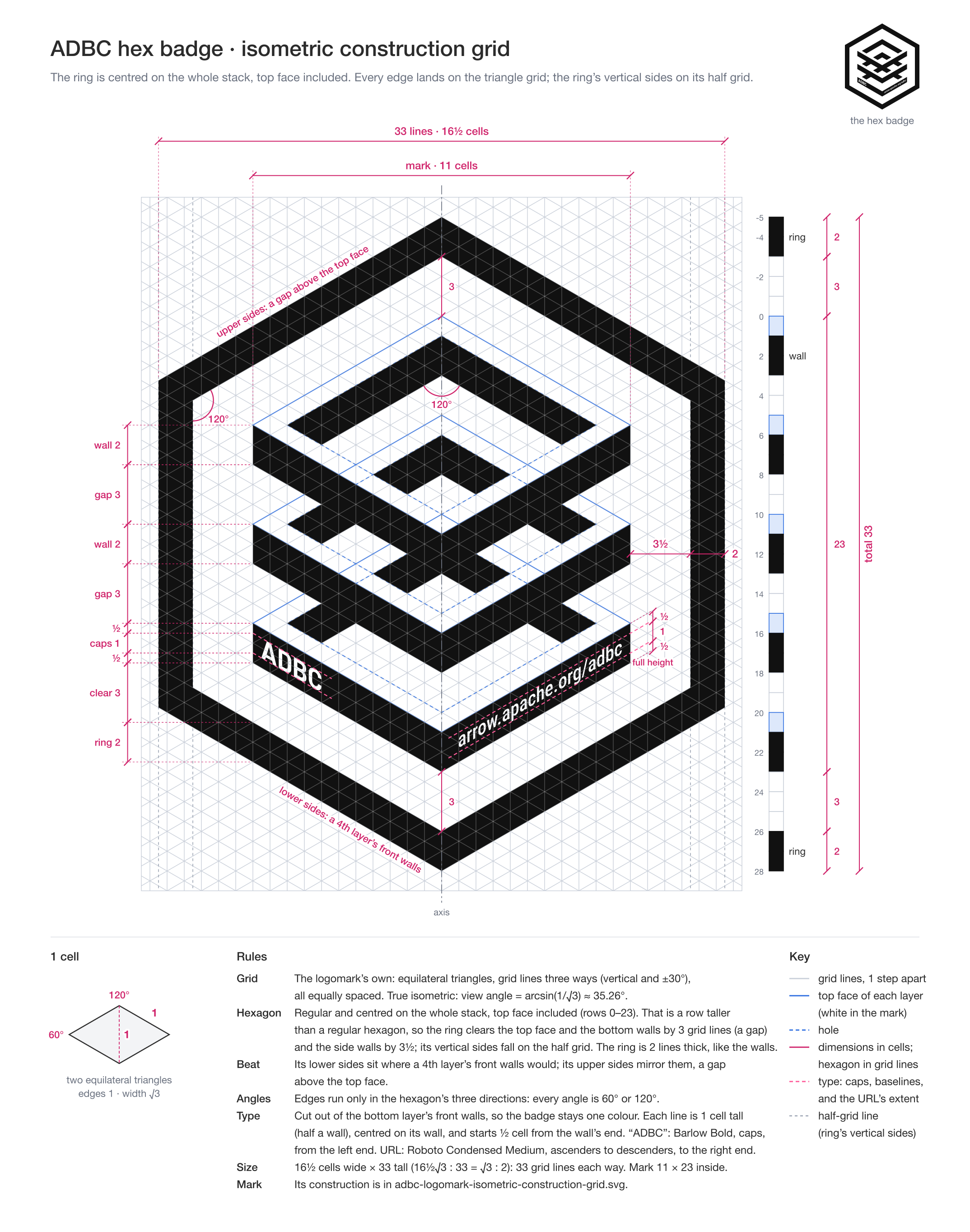
Hex badge
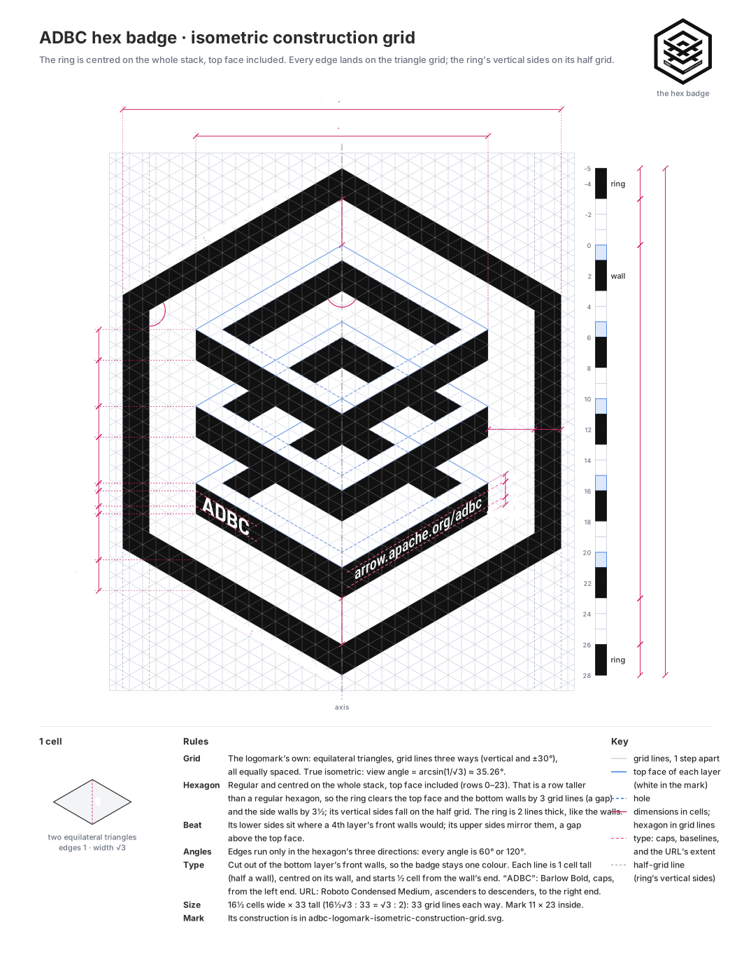
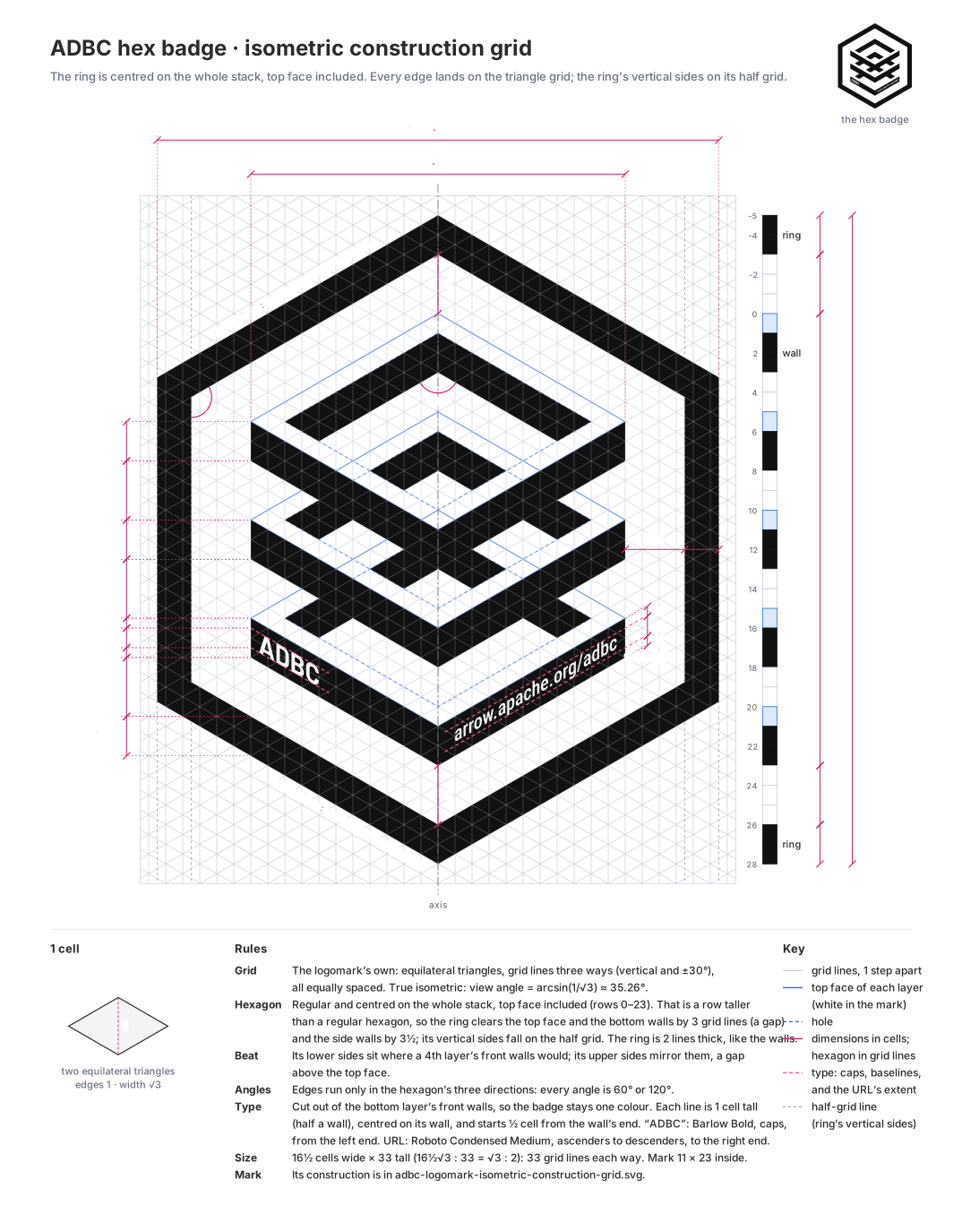
Grid: the logomark’s own. The mark is the logomark, unchanged except for the type cut out of it.
Hexagon: regular, and centred on the whole stack, its top face included. It clears the top face and the bottom walls by 3 grid lines, a gap, and the side walls by 3½, so its vertical sides fall on the half grid. Its outline is 2 lines thick, like the walls.
Beat: the hexagon’s lower sides sit where a fourth layer’s front walls would be, and its upper sides mirror them, a gap above the top face.
Type: cut out of the bottom layer’s front walls, so the badge stays one color. Each line is 1 cell tall, half a wall, centred on its wall, and starts half a cell from the wall’s end: “ADBC” by its caps, in Barlow Bold, and the URL from ascenders to descenders, in Roboto Condensed Medium.
Usage
Use the same isometric logomark in every variant, and don’t redraw it at another angle. Its 30° edges are what let it sit evenly in the hex badge’s hexagon and inside the sticker’s cut.
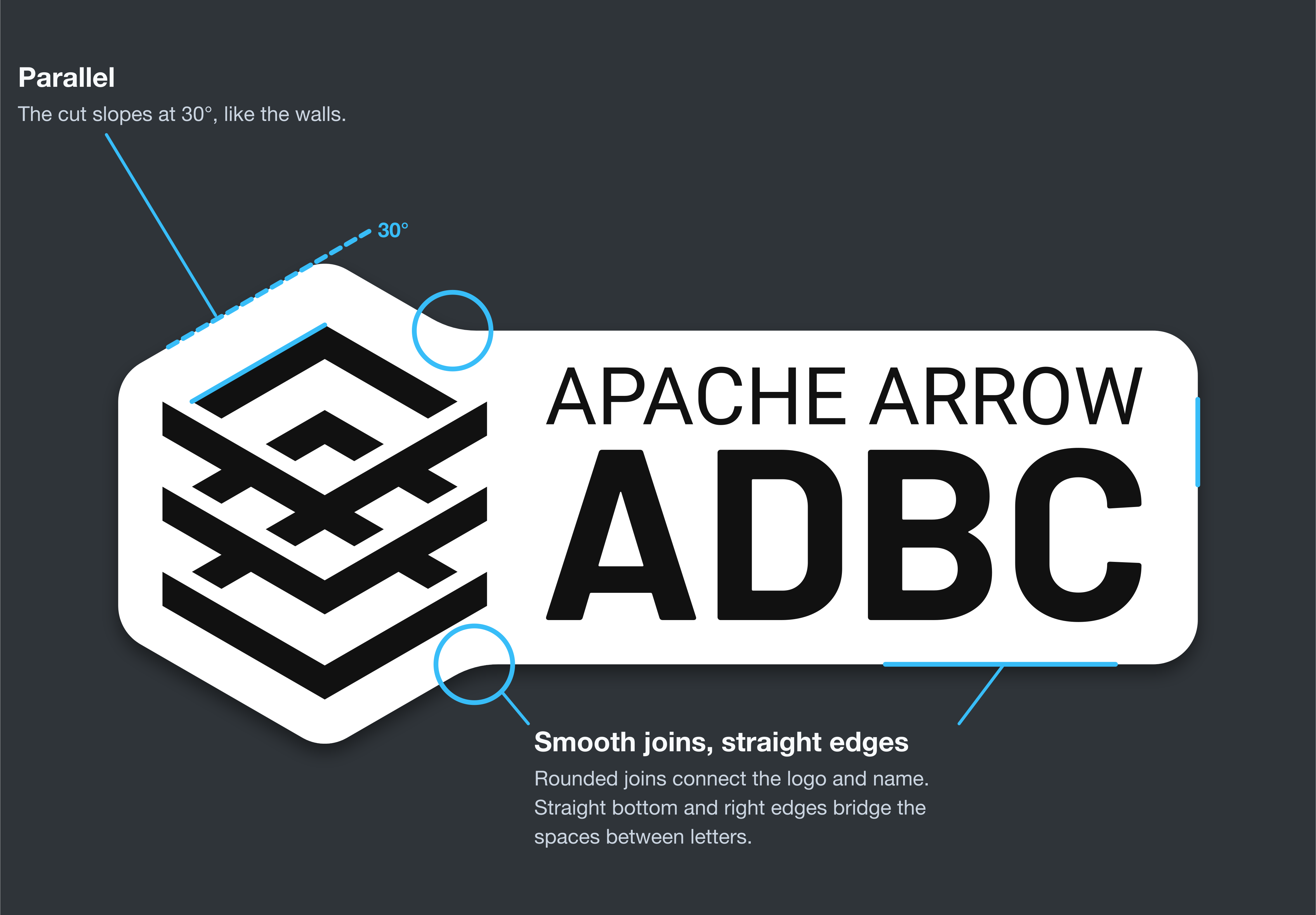
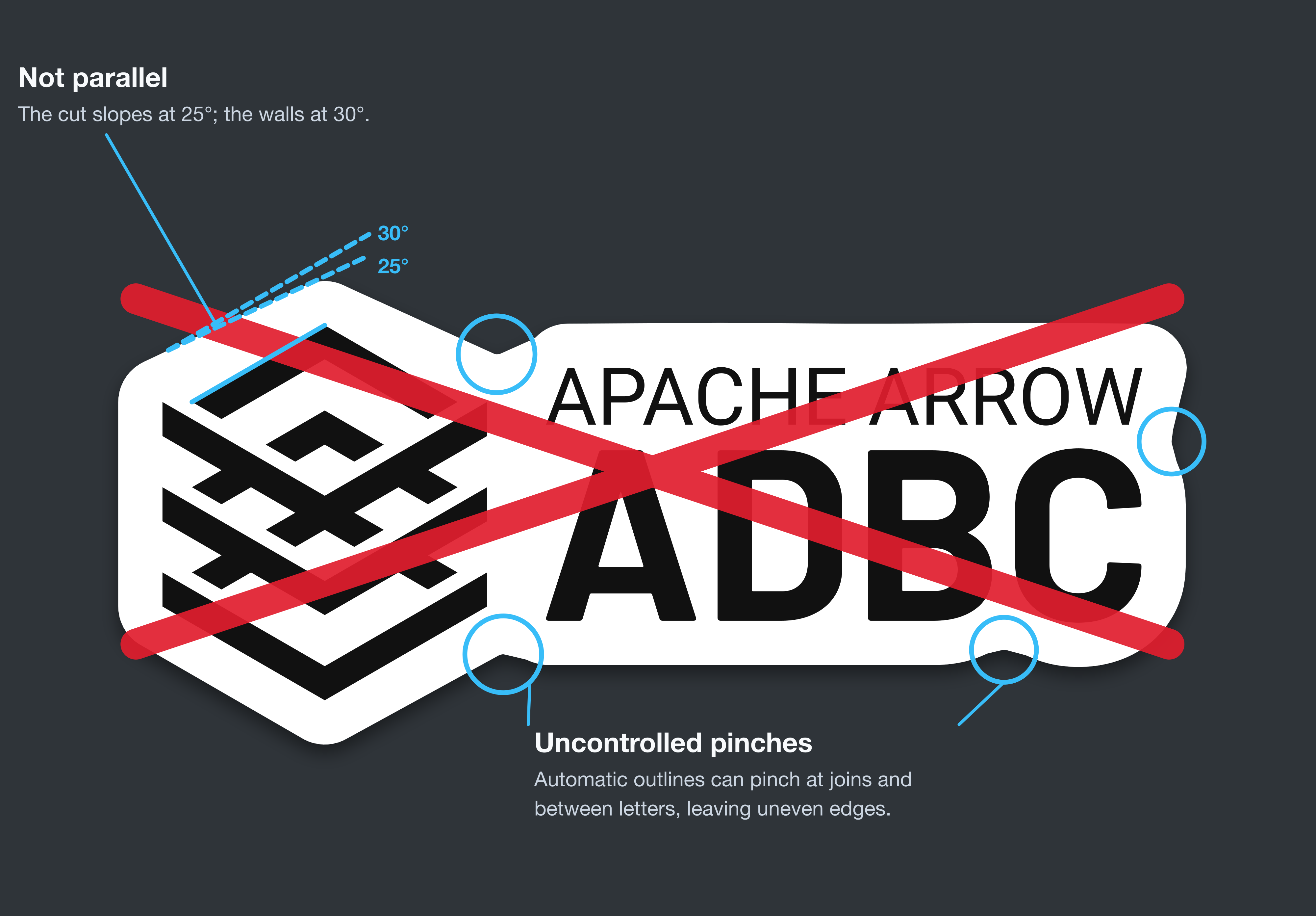
For stickers, use the supplied die-cut file. An automatic outline can change the edge angles and create unwanted pinches at joins and between letters. The approved cut runs parallel to the walls and places each join deliberately.
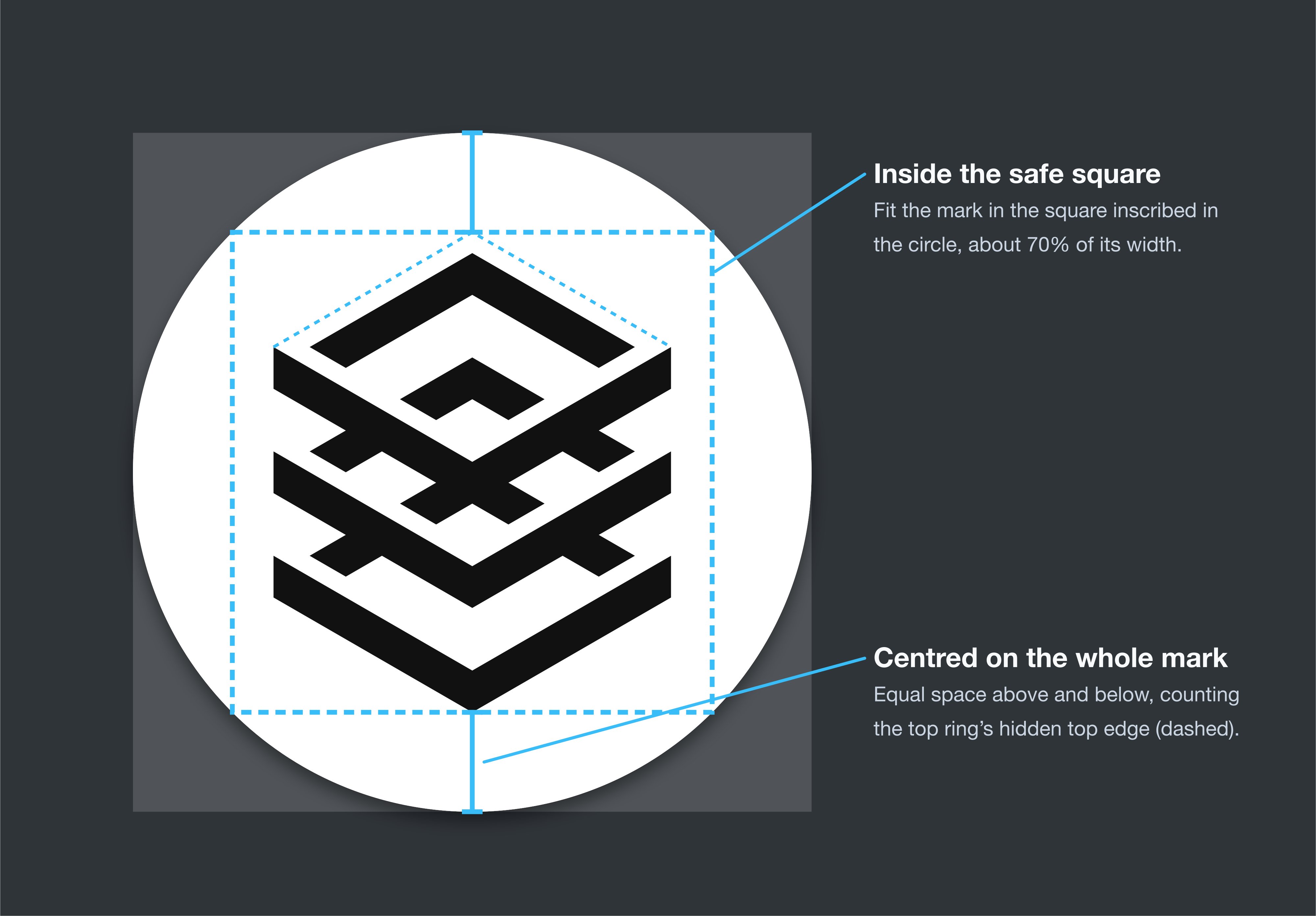
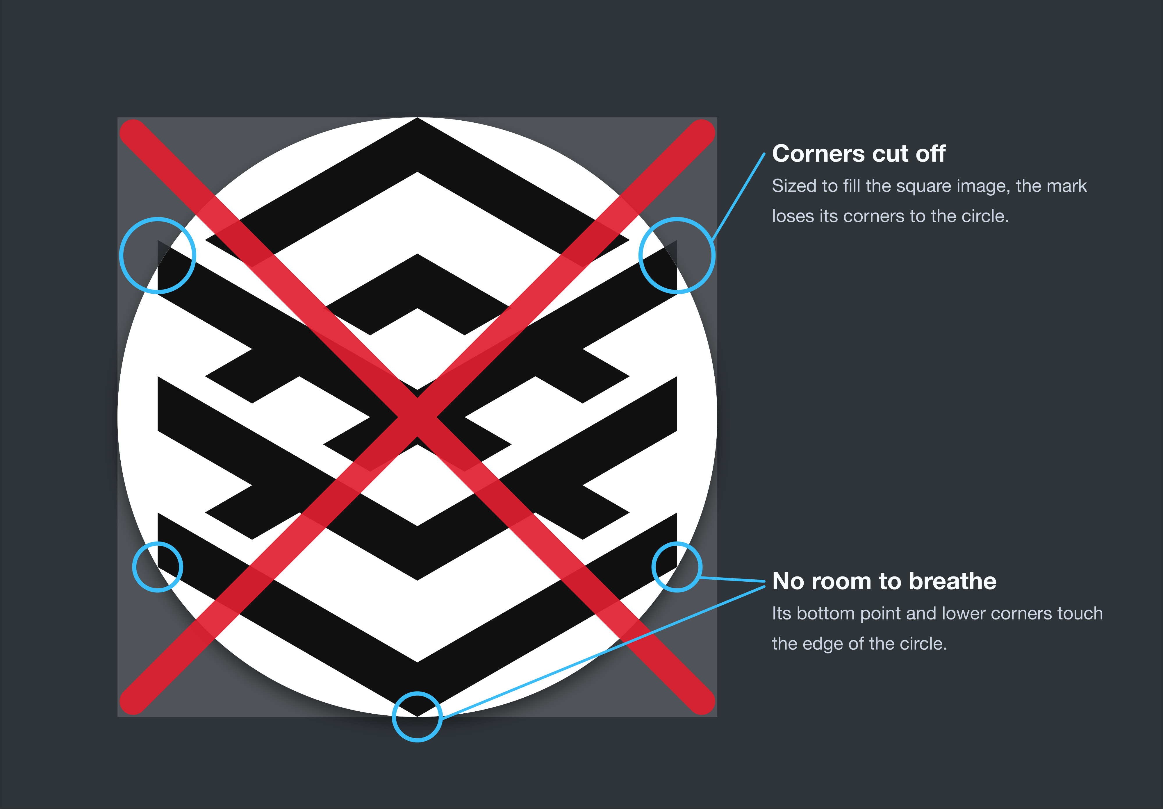
In a circle, such as an avatar on GitHub, Slack, or social media, use the logomark, not the lockup. Fit it inside the square inscribed in the circle, about 70% of the circle’s width, centred on the whole mark, top edge included. Supply a square image with a solid background, and let the platform crop it to the circle.
Downloads
The logos are black: the PNGs on white, the SVGs on a transparent
background. For a white logo on a dark background, invert the PNGs, or set
the SVGs’ fill to white, or to currentColor so they take the color of the
surrounding text.
Asset |
Files |
|---|---|
Horizontal lockup |
|
Logomark |
|
Hex badge |
|
Sticker print file |
|
Logomark construction grid |
|
Horizontal lockup construction grid |
|
Hex badge construction grid |
In the logo files, all lettering is converted to shapes, so the fonts don’t need to be installed to use them. The fonts are Barlow Bold, Roboto Regular, and Roboto Condensed Medium.