Visual Identity for Apache Arrow
As a community project, the visual identity guidelines for Apache Arrow attempt to balance the need to maintain consistent visual imagery in formal contexts, while allowing flexibility for fun and creative reuse of the Apache Arrow logo in informal contexts. On this page you can find the following resources:
Design of the logo
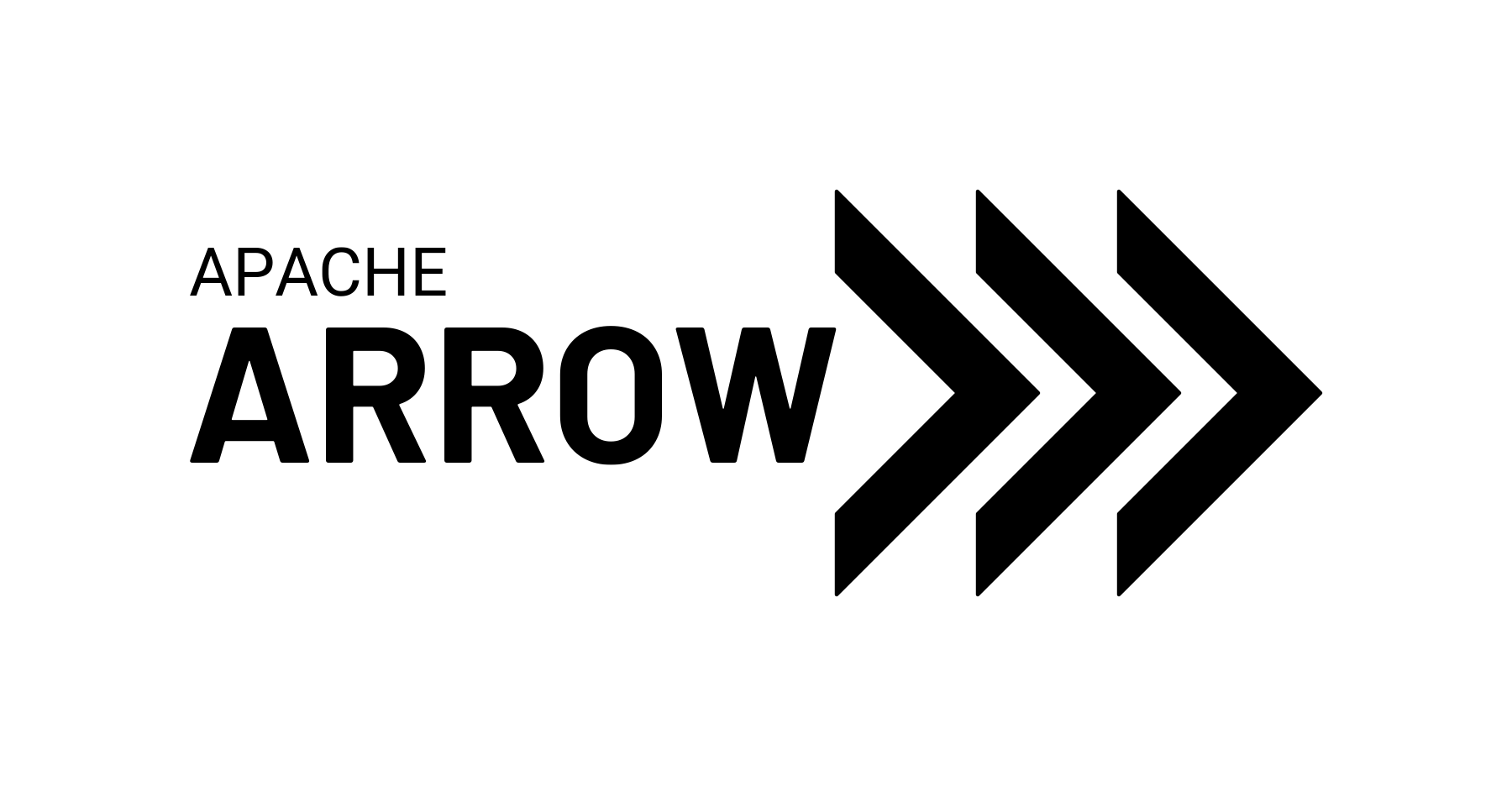
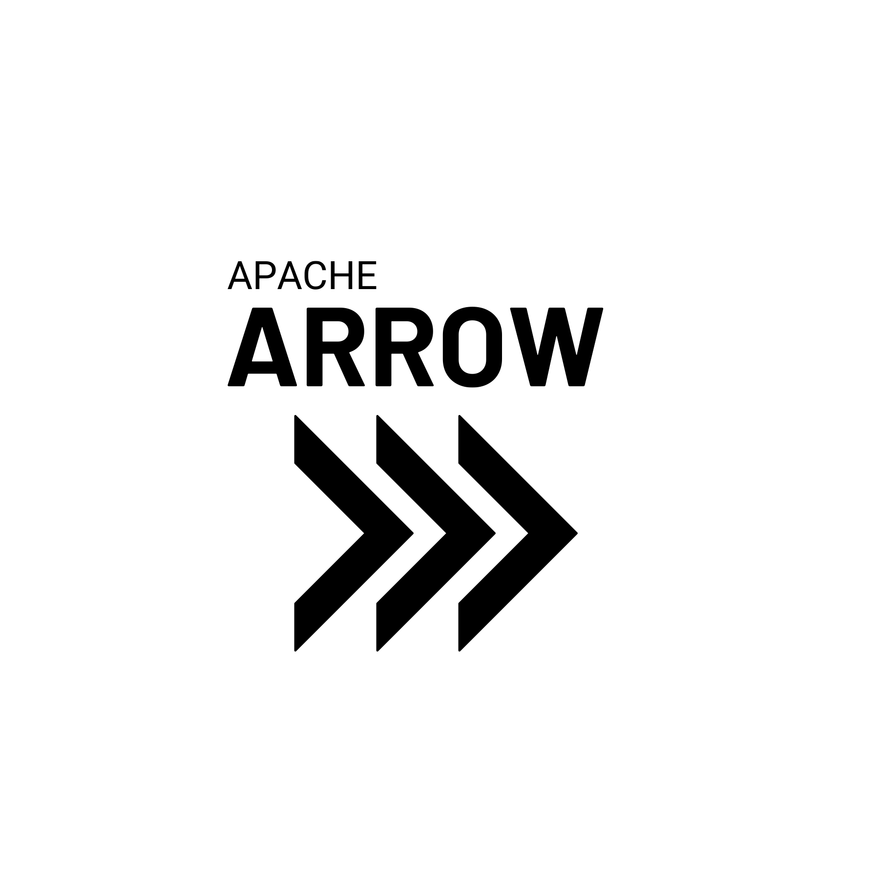
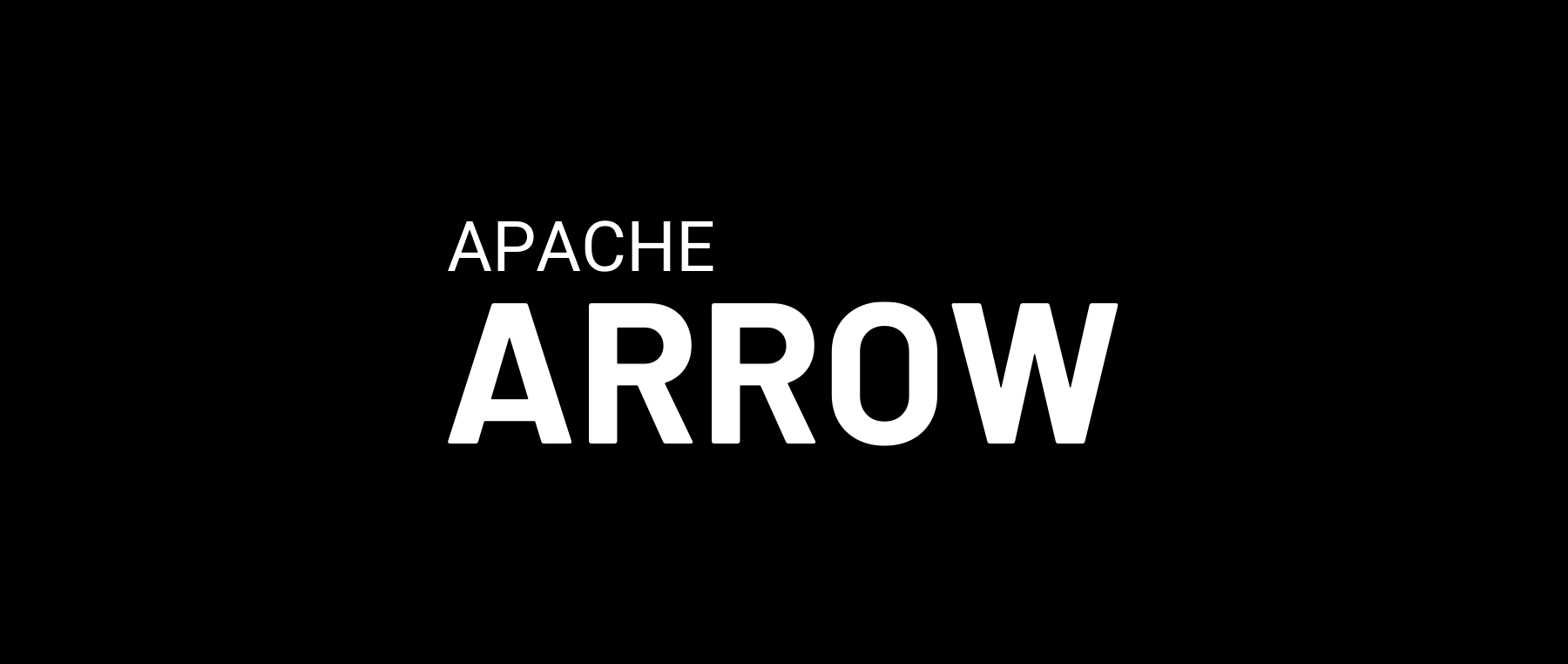
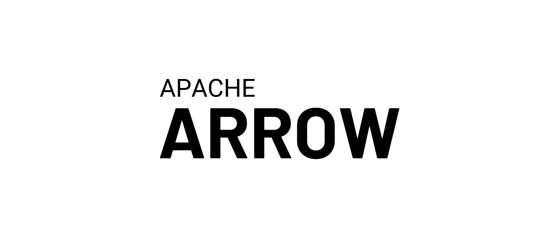
The Apache Arrow logo consists of the "Apache Arrow" logotype and the "Triple Chevron" logomark, arranged horizontally with the text placed to the left of the image. The standard "light theme" version of the logo uses black text and image against a white background, and the standard "dark theme" version of the logo is white against a black background. The light version looks like this:
The word "Apache" in the logotype is written in all caps Roboto font, and the word "Arrow" is written in all caps Barlow font in boldface. Both should use normal font kerning. The precise font size may depend slightly on the display context but the intent is that the word "Arrow" be approximately 3 times the height, and approximately 2.5 times the width of the word "Apache". The text should be left-justified, with the leftmost edge of the first letters in both words aligned horizontally.
The annotated image below shows the precise spacing used in the horizontal version of the Apache Arrow logo as well as the design of the Triple Chevron. Each chevron has width exactly half its height, and forms a 90-degree angle at the tip. The thickness (both vertically and horizontally) of the chevron is 20% of its height. The spacing between adjacent chevrons is 15% of the height (i.e., if height = 100, width = 50, and spacing = 15).
The horizontal midline of the word "Arrow" is aligned with horizontal midline of the chevrons, and the height of the word "Arrow" is approximately 1/3 the total height of the chevrons. Similarly the midline of the word "Apache" is aligned with the upper-inner vertex of the chevrons. The logotype and logomark are placed flush against one another, with the rightmost tip of the "W" in "Arrow" vertically aligned with the leftmost edge of the chevrons.
The horizontal layout above is the preferred variant of the Apache Arrow logo, but there will be cases where the full logo doesn't fit. There will be situations where using the "Apache Arrow" logotype alone or the "Triple Chevron" logomark alone is the most appropriate thing to do: the expectation is that people use their best judgment.
In addition to the partial (logomark-only and logotype-only) layouts, there may be cases where a vertical layout work best. The vertically oriented logo attempts to preserve the same look and feel as the horizontal version, and preserves some points of horizontal alignment between components of the logotype and logomarks:
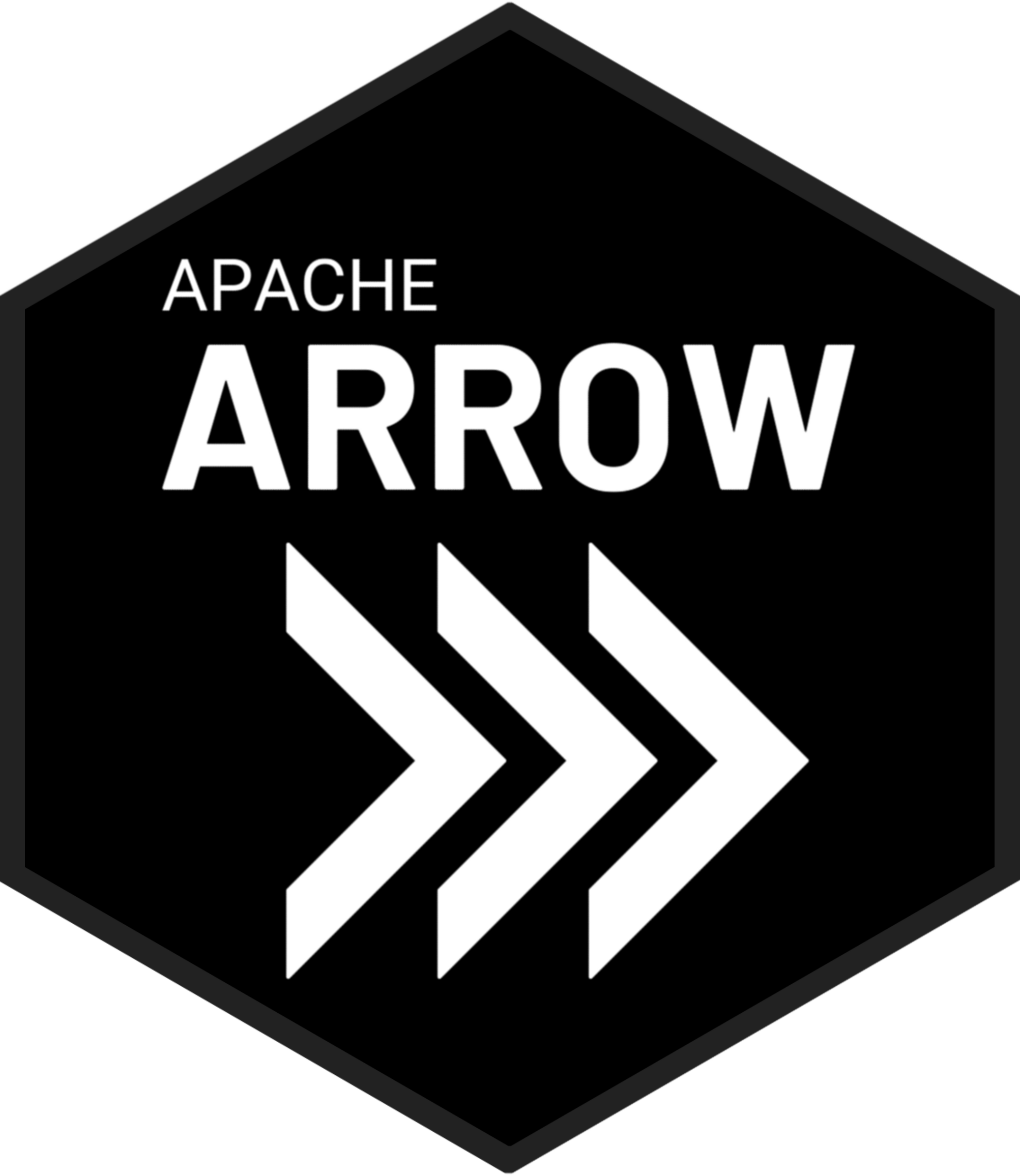
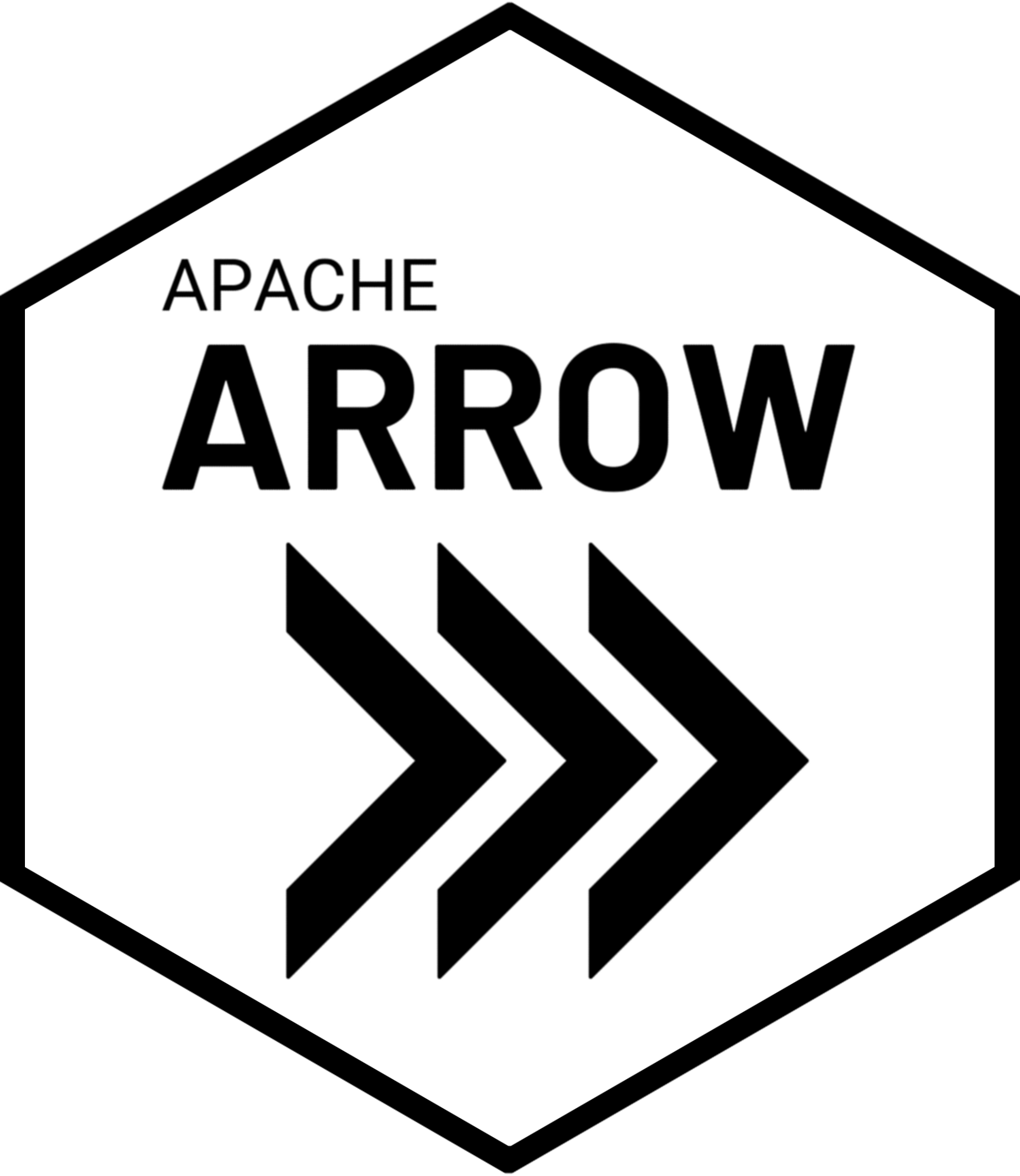
A good example of when the vertical layout is more appropriate is in the context of hex stickers. The standard version of the hex sticker arranges the vertical within a hexagonal frame so that it has some alignment with the native symmetries of the hexagon shape:
Variations of the logo
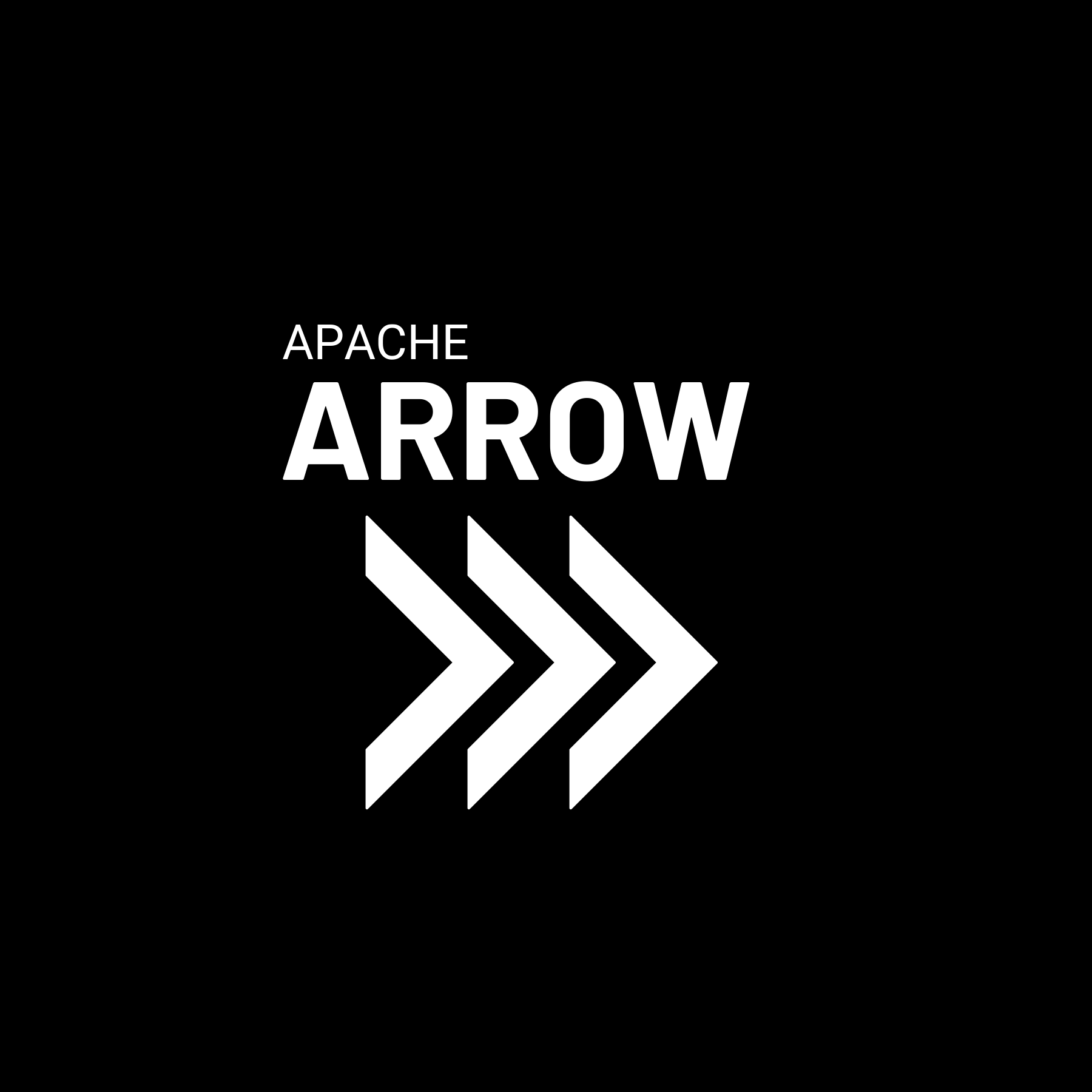
At the bottom of this page you can find the complete list of all logo-related files provided by the Apache Arrow project. The logo exists in a light theme and a dark theme, and these versions are usually simple inversions of one another. The light theme uses black text against a white (or other light colored) background:
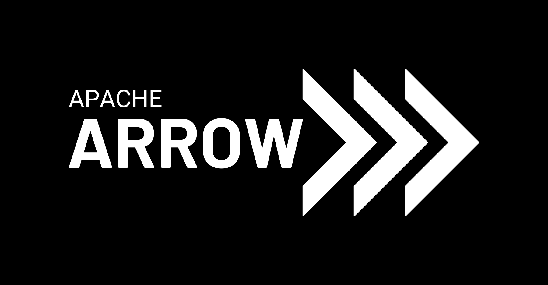
Similarly, the dark theme uses white text against a black (or other dark colored) background:
The image files in this repository include both variants, and include versions with transparent backgrounds as well as opaque backgrounds. It is entirely acceptable to use the transparent background variants against backgrounds that aren't precisely white or black, as exemplified by the main page on this site.
Horizontal and vertical versions of all variants are included:
Similarly, two official variations of the hex sticker are provided:
The repository also includes files for "Triple Chevron" logomark on its own
and the "Apache Arrow" logotype on its own:
Using the Apache Arrow logos
General guidelines
Usage guidelines for official logos are quite similar across many brands, and Apache Arrow is no exception. The core principle is to respect the visual integrity of the logo. Guidelines that will help you do so include:
- Please don't visually distort the logos
- Please reproduce at a clearly visible resolution
- Please don't modify the text or the design of the chevrons
- Please don't add additional text to the logotype or imagery to the chevrons
In general, the principles laid out in the Apache Foundation Style Guide for usage of the Apache logo are also appropriate for the Apache Arrow logo. If you're in a situation where you want to refer formally to the Apache Arrow project you should adhere to these guidelines pretty closely and avoid modifying the official logos.
Regarding unofficial images
That said, there are occasions where you may want to use the logo unofficially. The purpose of the visual identity guidelines as described so far is to provide guidance on what to do when you do need to refer to Apache Arrow in an official or formal way. It's not meant to prevent people from having fun creating unofficial images when appropriate.
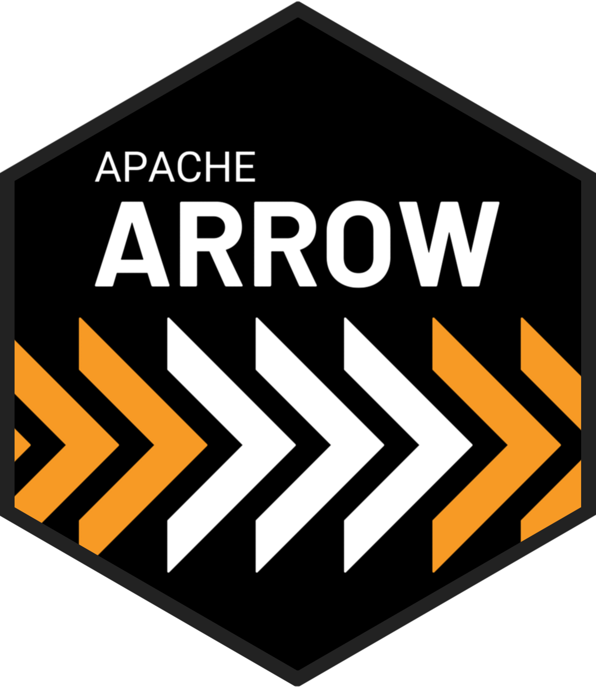
To provide useful guidance on when unofficial images are acceptable and unacceptable, here are two examples:
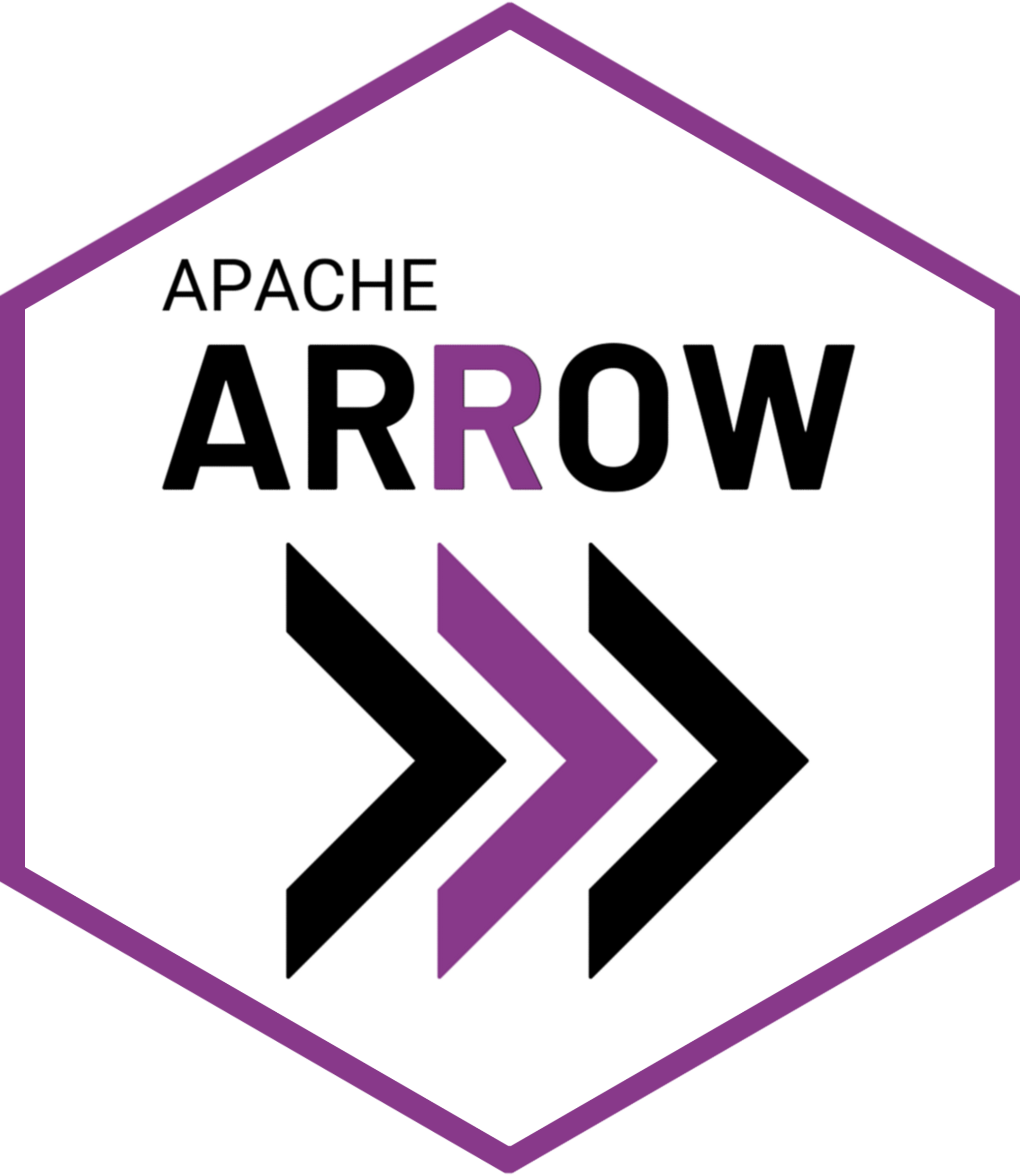
The image on the left highlights the letter R and one of the chevrons in a fashion that is reminiscent of the R prompt, using colors that align with those used by the R-Ladies organization. Using this image informally as part of a presentation to an R-Ladies meetup would be consistent with the Apache Arrow guidelines, because it is thematically appropriate to the context and the image is not being presented as if it were the official Apache Arrow logo. The purple elements have been introduced to the image in a manner that leaves the visual integrity of the Apache Arrow logo intact, and in a fashion that reflects the informal context-specific use within an R-Ladies meetup.
The image on the right adds extra orange colored chevrons to the dark themed hex sticker. Again, this is clearly not part of the official Apache Arrow visual identity and should not be presented as such. For this to be appropriate, even informally, the context would need to be one in which the orange elements are meaningfully connected to the surrounding imagery (e.g., perhaps the orange chevrons continue horizontally in either direction) so that the core of the Apache Arrow logo itself remains visually coherent.
Many other context-appropriate informal variations can be imagined. For example, if Apache Arrow were being used to power a generative art system, the background fill to the logo might not be a solid color, it could be the art itself. Again, the overriding principle is that the visual integrity of the Apache Arrow logo remains intact and the modifications are appropriate to the context in which it is used.
List of provided logo files
Horizontal logos
- Horizontal Arrow logo, PNG format, white text, and black background
- Horizontal Arrow logo, SVG format, white text, and black background
- Horizontal Arrow logo, PNG format, white text, and transparent background
- Horizontal Arrow logo, SVG format, white text, and transparent background
- Horizontal Arrow logo, PNG format, black text, and white background
- Horizontal Arrow logo, SVG format, black text, and white background
- Horizontal Arrow logo, PNG format, black text, and transparent background
- Horizontal Arrow logo, SVG format, black text, and transparent background
Vertical logos
- Vertical Arrow logo, PNG format, white text, and black background
- Vertical Arrow logo, SVG format, white text, and black background
- Vertical Arrow logo, PNG format, white text, and transparent background
- Vertical Arrow logo, SVG format, white text, and transparent background
- Vertical Arrow logo, PNG format, black text, and white background
- Vertical Arrow logo, SVG format, black text, and white background
- Vertical Arrow logo, PNG format, black text, and transparent background
- Vertical Arrow logo, SVG format, black text, and transparent background
Hexagonal logos
- Hexagonal Arrow logo, PNG format, white text, and black background
- Hexagonal Arrow logo, PNG format, black text, and white background
Chevron-only logos
- Chevron-only Arrow logo, PNG format, white text, and black background
- Chevron-only Arrow logo, SVG format, white text, and black background
- Chevron-only Arrow logo, PNG format, white text, and transparent background
- Chevron-only Arrow logo, SVG format, white text, and transparent background
- Chevron-only Arrow logo, PNG format, black text, and white background
- Chevron-only Arrow logo, SVG format, black text, and white background
- Chevron-only Arrow logo, PNG format, black text, and transparent background
- Chevron-only Arrow logo, SVG format, black text, and transparent background
Text-only logos
- Text-only Arrow logo, PNG format, white text, and black background
- Text-only Arrow logo, SVG format, white text, and black background
- Text-only Arrow logo, PNG format, white text, and transparent background
- Text-only Arrow logo, SVG format, white text, and transparent background
- Text-only Arrow logo, PNG format, black text, and white background
- Text-only Arrow logo, SVG format, black text, and white background
- Text-only Arrow logo, PNG format, black text, and transparent background
- Text-only Arrow logo, SVG format, black text, and transparent background